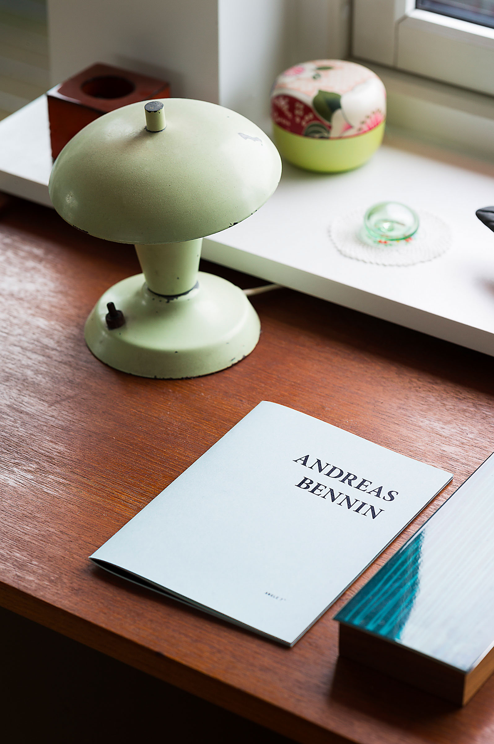
A Supreme Balancing Act, Snøhetta
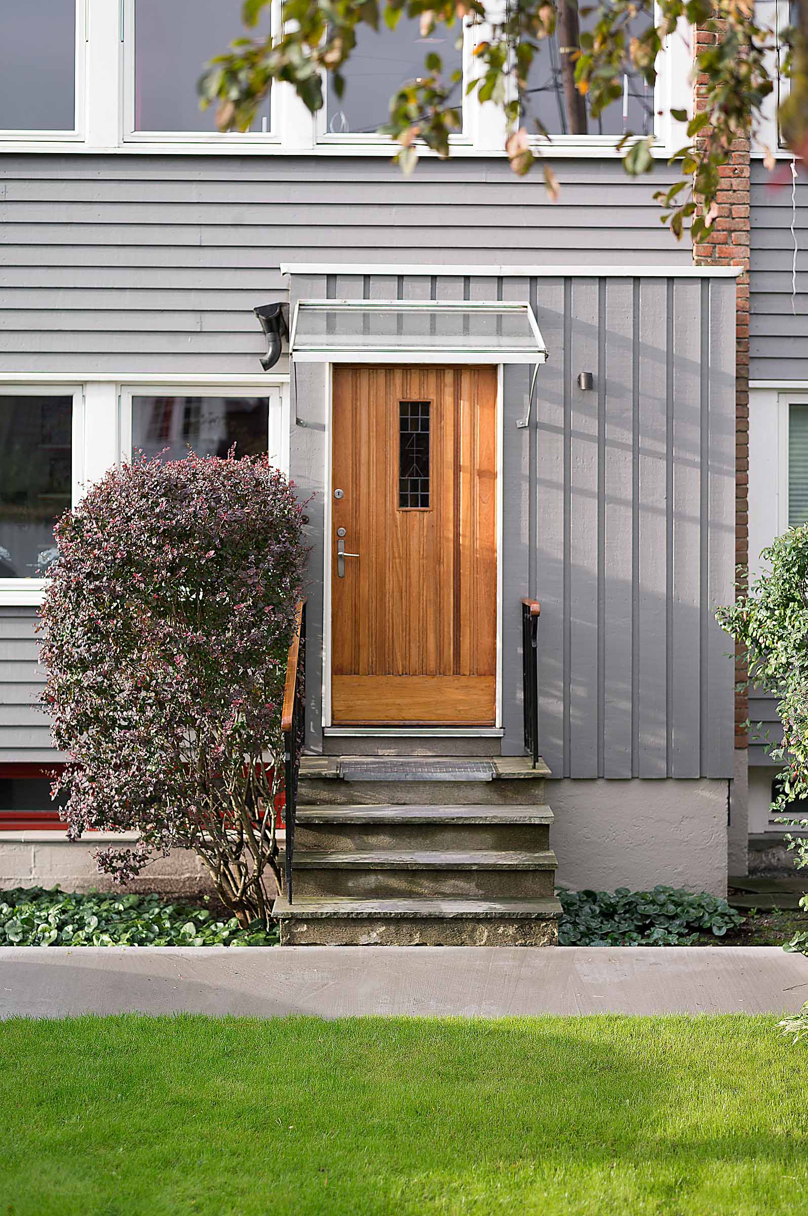
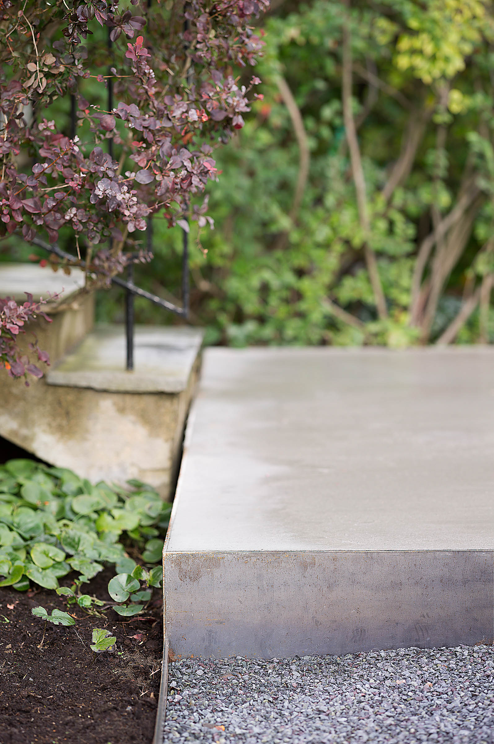
if your means are unlimited, it's really very easy to create something great. what i'm most happy about here however, is how much we've accomplished with limited resources, says architect andreas nygaard.
He, and his interior architect wife Heidi Pettersvold Nygaard, have made a rather exceptional home. The house dating back to 1963, has been allowed to keep its vital details, but after the Nygaards have left their signature marks, the overall expression is markedly different. -One of the first things you said when we came for a viewing, was that we had to get rid of the kitchen, says Andreas Nygaard, glancing over at his wife Heidi Pettersvold Nygaard. -But, we kept it. This was a move up for us, and we weren’t able to make all the changes we might have liked to- like the kitchen, and the bathroom. The challenge was really to make it ok anyway, he says.
The semi-detached house located behind one of Oslo’s main attractions, the Vigeland Park, has a very simple starting point. With its clean lines and low ceilings, it was quite the transition for a family of five, that moved here from a colourful apartment with tall ceilings adorned with stucco, closer to the city centre.
-That we ended up here was actually quite random. We swung by the viewing after having spent two years prior scouring the city centre for an apartment with a sensible layout, size, and price. We realised we needed more space for our family, says Heidi.
-I remember walking up the stairs, catching a glimpse of the view- and fell in love immediately.
The house itself is pretty compact. On the second floor there is the kitchen and living room, and an endless row of windows on both sides. Which made the move from those 3 meter tall ceilings, into the minimum standard of 2 meters and 40 cm here, livable.
-When the sun shines in, it’s pretty amazing, and you can see the sea, all the way out to the Oslo fjord and Fornebu, the old airport.
THREE FLOORS OF CLEAN LINES AND FUNCTIONALITY
-We have a laundry room in the basement, bedrooms enough for everyone- and even though the rooms are much smaller, they’re really well proportioned. These houses come in rows of three, for about a mile down the road. The whole area really, is architecturally fascinating- or, that might be an exaggeration, but the houses have that little something, and are really well proportioned, says Heidi.
-Yeah, it really rouses the architects in us, says Andreas.
MORE LIGHT
In order to maximise the light and spaciousness on the second floor, they chose to tear down a few walls before moving in, in order to make one big open space.
-The kitchen was separate, as they were at the time the house was built- but we don’t need that now. In order to maximise, and improve, the entire kitchen, we had a concrete top, custom made. It’s designed in one complete mould. The cupboards were covered in plywood teak, and we made a lamp over the fan to hide it.
THEY DON’T USE THE TERM REFURBISHMENT
But prefer to refer to it as ‘cleaning up’ instead. Away with the curtain rails and redundant details- but careful not to remove too much of what the architect originally had thought out.
-When you move to a house like this, it’s easy to fall for the temptation to do a total makeover and remove all its original fittings. We’ve come to realise instead, that you have to learn to love the specific character of a house. That’s why we’ve chosen not to replace the fireplace with something more modern, nor paint it white- even though that really would have been the simplest solution. Add to that, we’re really happy we kept the original doors. If you take away too much, the house stands in danger of losing the very thing that got you hooked in the first place- the small imperfections, says Heidi.
INSTEAD
they chose to accentuate the shape of the fireplace by building a box for storing firewood on the backside of it, which extended its shape.
-We really enjoy singling out details and highlighting them. To consciously nurture and show them off, says Andreas.
And very often, they come up with customised solutions and furniture.
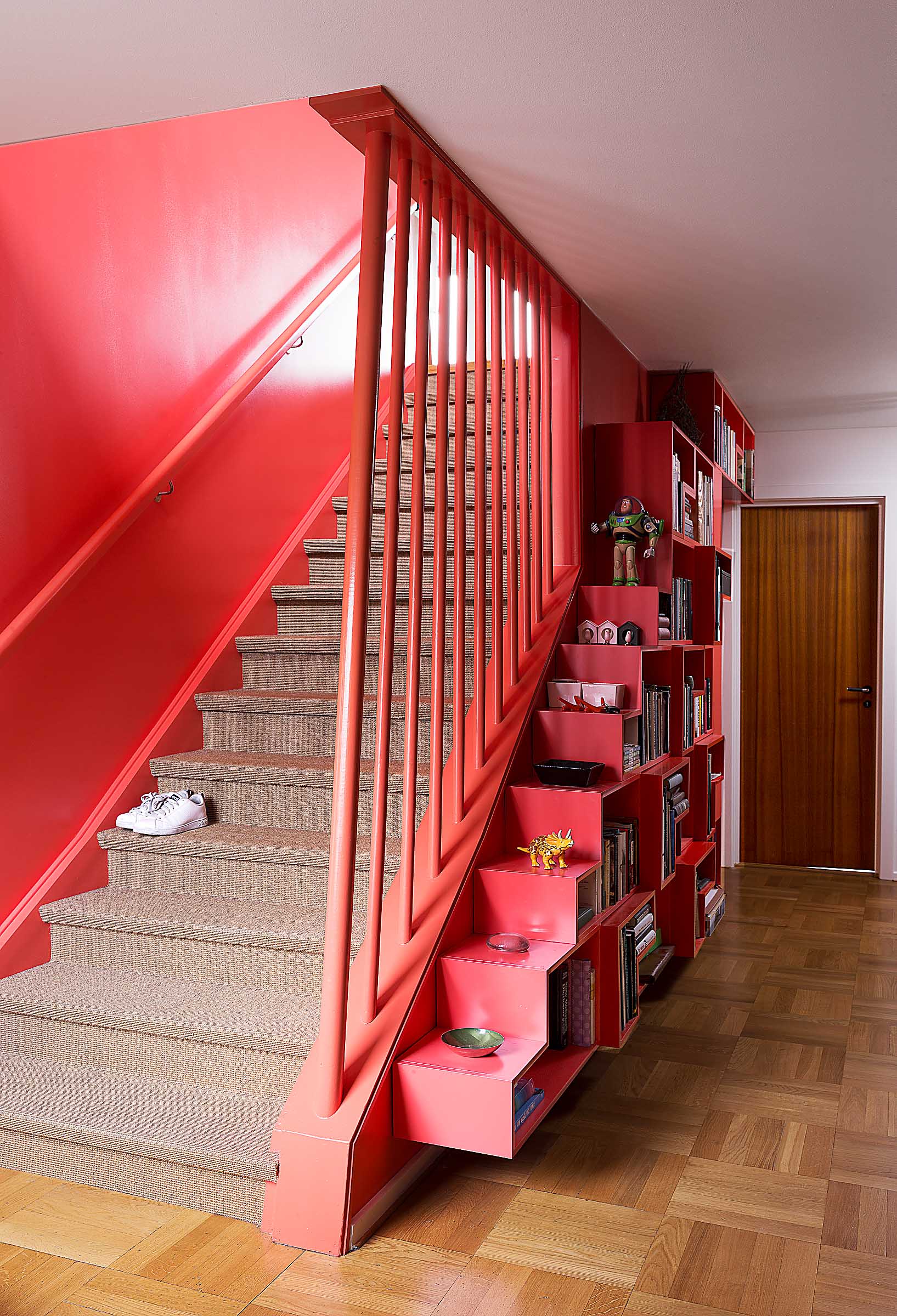
-When we decided to have a row of shelves in the hall downstairs, we built them ourselves- and they mirror the shape of the staircase. The shelves are made up of different size modules that allows for normal sized books, as well as extra wide one’s, and it extends the lines of the staircase itself.
-Add to that we thought it was such a great idea, we really should have it produced!
PUNKY COLOURS
But, they had to do some crazy stuff, or pranks, as they call them, especially when considering the predominantly earthy tones the former owners had used on the walls.
-We had to go big in order to get a little oomph in an otherwise fairly humdrum house. And we did have some pretty far-out ideas about what we ideally would like to do, but the challenge was to see what could be done, within our budget. We made use of inexpensive materials that nevertheless resulted in something we were quite pleased with, says Andreas.
-When we removed the walls to the kitchen, it was as if a new room appeared, around the staircase – which we decided to paint, says Heidi.
You can make really grand and bold changes by simply painting, and when Heidi makes up her mind, she goes all in. No holds barred.
-I admit I was slightly reticent when I saw the colour, but then again, she’s never been wrong before, says Andreas about the colour that clad the staircase and the area around it.
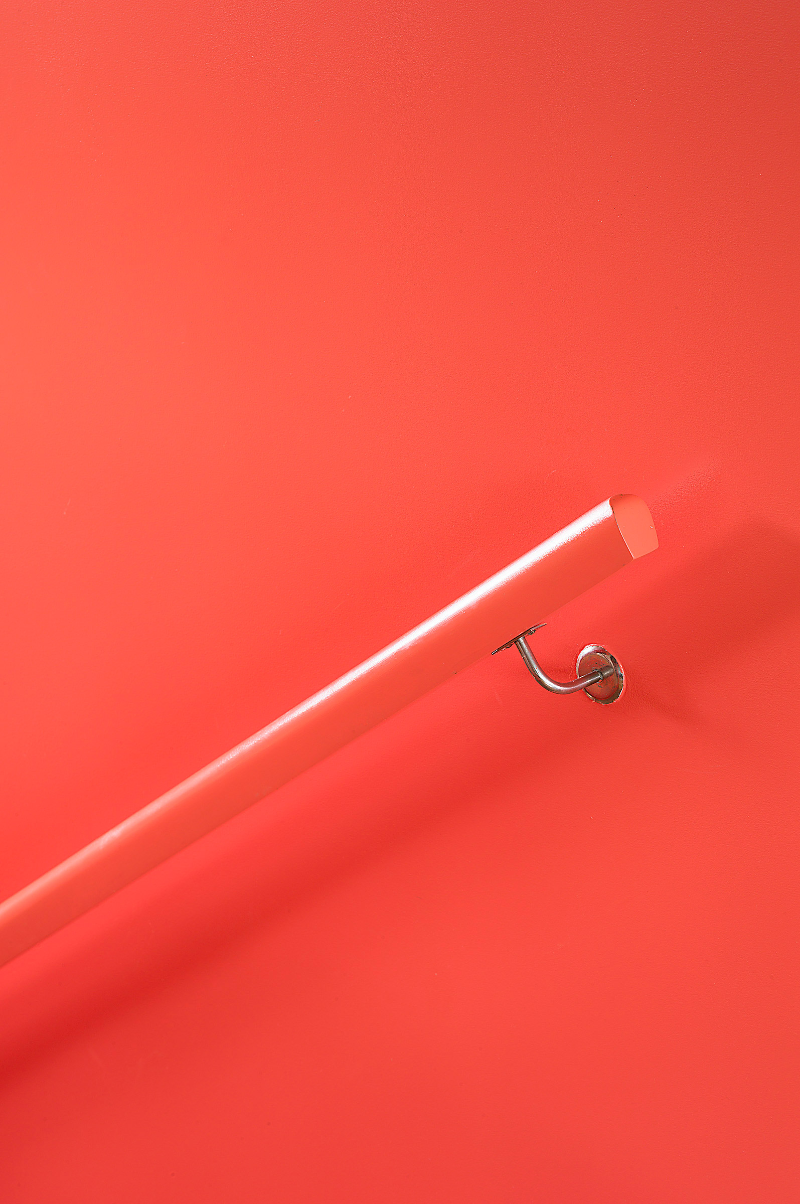
-I’m really fond of those slightly undecided colours, ones that exist in between two colours, says Heidi.This one’s not pink, nor orange, and definitely not red.
Whatever the colour, it’s become a kind of core, tying the different floors together.
-Even though I consider our house fairly sober, I think it’s fair to say we’ve made changes here, that others in similar houses probably haven’t considered, says Andreas. When I come home at night, in the dark, there’s a glow to this house compared to the neighbours. That’s due in part to our choices of lighting, but more than that, it’s an effect of not having an all white home. The colours and the materials we’ve used transforms the light completely.
WORDS : Annicken Vargel (translated by The Chromarty)
PHOTOS: The Chromarty


