A Great Merger and a productive marriage
Words and Photos: Elisabeth Aarhus
A Great Merger
and a productive marriage
When returning home to Oslo about twenty years ago, with my very British ex-husband and two kids, after 5 years of living in the smaller towns of England, the landing was not as soft as expected. The Englishman started to learn the Norwegian language but soon came home with a new found friendship to a fellow ex pat who only spoke the queens language. Even though my then beau only drank tea with milk and sugar, the two had met in a coffee shop in St Hanshaugen, (when smaller coffee shops were quite rare and exotic in Oslo). The Englishman worked as an interior architect we soon learned, and he had just put the finishing touches on the then groundbreaking interiors of Åpent Bakeri at Damplassen.
Let them have Bread?
In any case.. The monumental space which the above-mentioned Brit had created is set within a neighborhood of Oslo with a certain resemblance to the council estates spread all over the UK. The space however, was extraordinary. The housing model of Ullevål Hageby derives from Ebenezer Howard who first presented it in Tomorrow in 1898 and in a reworked edition of the publication Garden Cities of Tomorrow in 1902. The idea was to build small, self-sufficient units on the outskirts of large cities - the working class were to have reasonably spacious, healthy homes with a small patch of green. Today, these small brick houses are mostly inhabited by an upper middle class rich in cultural capital and networks, if not necessarily cash. Seen in hindsight, this well-educated enclave was obviously the perfect spot for a new bakery concept, hungry as its inhabitants were for «authentic living».
I recall how overwhelmed we were upon entering the space just before the official opening. Added to the high quality of the products baked in-house, the concept as a whole soon turned the brown bakery bags into a symbol of those in the know…And, the place was always packed, the queues endless, even for a sit-down breakfast which at that time was either a croissant or piece of bread with homemade strawberry jam. On most mornings in those days, well-known authors such as Linn Ullmann and Niels Fredrik Dahl amongst others could be spotted whilst we were still reading paper papers.
Darrell
Now, one of the best kept secrets within Retail design in this country, must be interior architect Darrell Shrubb. Having worked backstage at Åpent Bakeri since its inception, Darrell has set the stage for the sale of pastry and bread at Damplassen, and regularly created new spaces for them at very different locations, all with their unique backdrops and concepts; in the Barcode, at Torsov, Ullevål Hageby and Røa- now serving Pizza, gourmet food, pastry and bread, doughnuts and coffee you name it. With an effortless flair he has over the past 20 years created tailored rooms made with long lasting and organic materials filled with a mix modern and functional design, mid century furniture and with a sprinkle of contemporary art like Cathrine Maske’s unusual combination of glass and photography used at Damplassen. His very first venture in Norway was at Riss Interiørarkitekter working for Petter Abrahamsen, who prepared him for the success in retail design. Since then it has been Åpent Bakeri all the way, with a short but sweet intermission working with Kaffebrenneriet when establishing their headquarter at the old Firestation in Grønland.
Darrell is particularly happy working behind the scenes, or should I say ‘setting a scene’ where those who hunger for quality eats can enjoy them in a meticulously planned space. These are spaces with a timeless elegance (not too rustic nor too modern and certainly no cheaply framed posters on the wall) and a business plan built to last. What could be more sustainable than that?
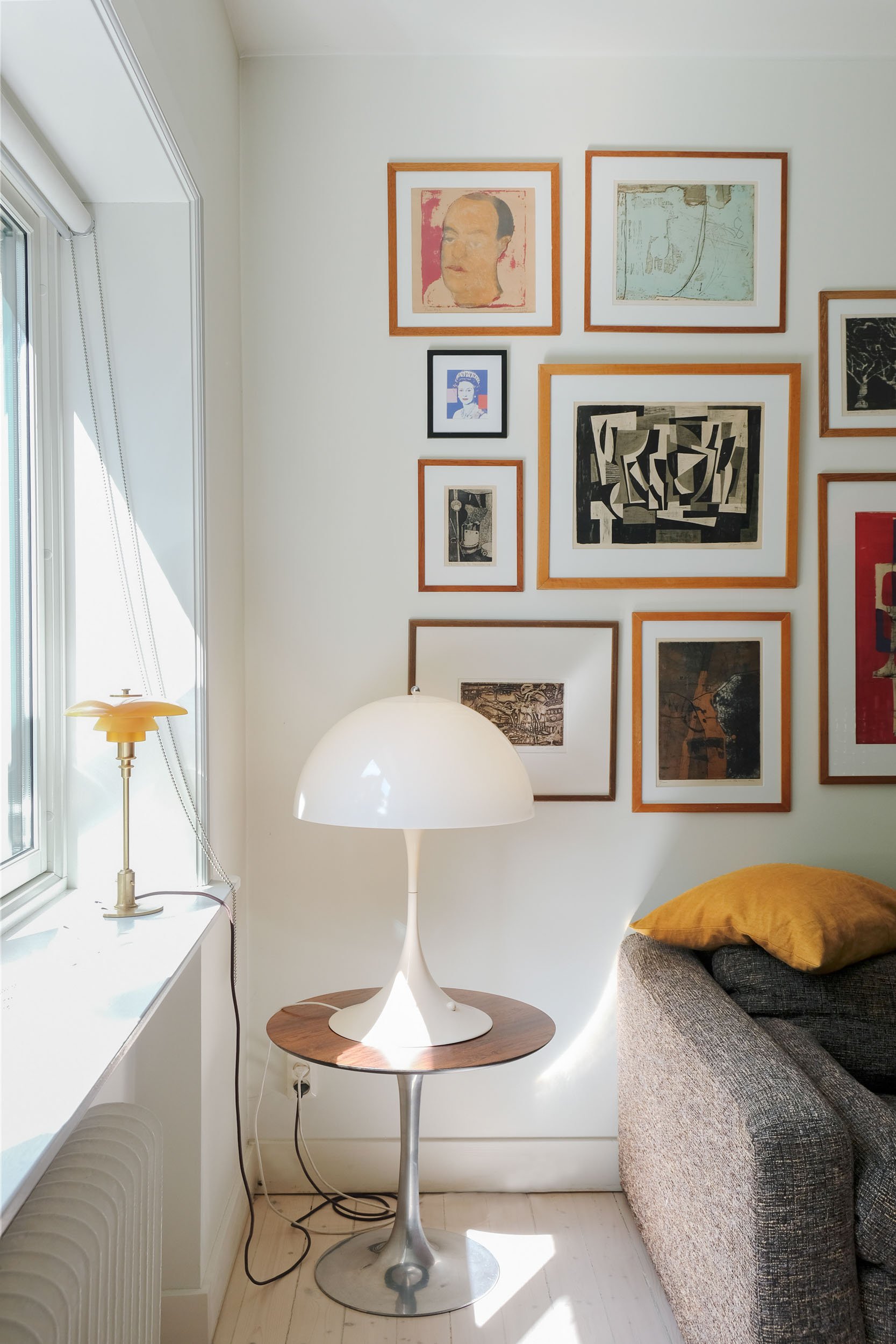
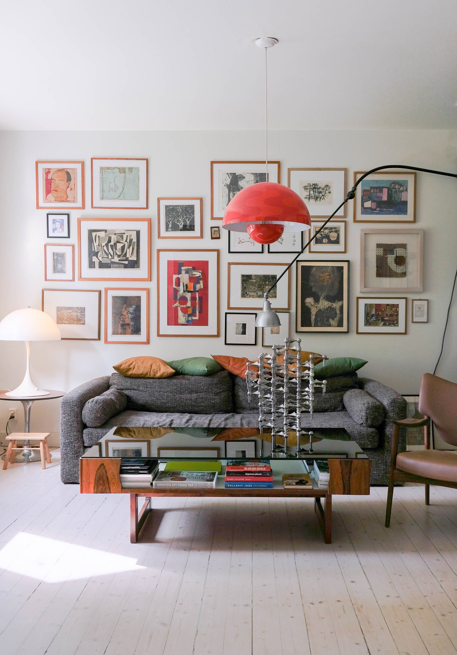
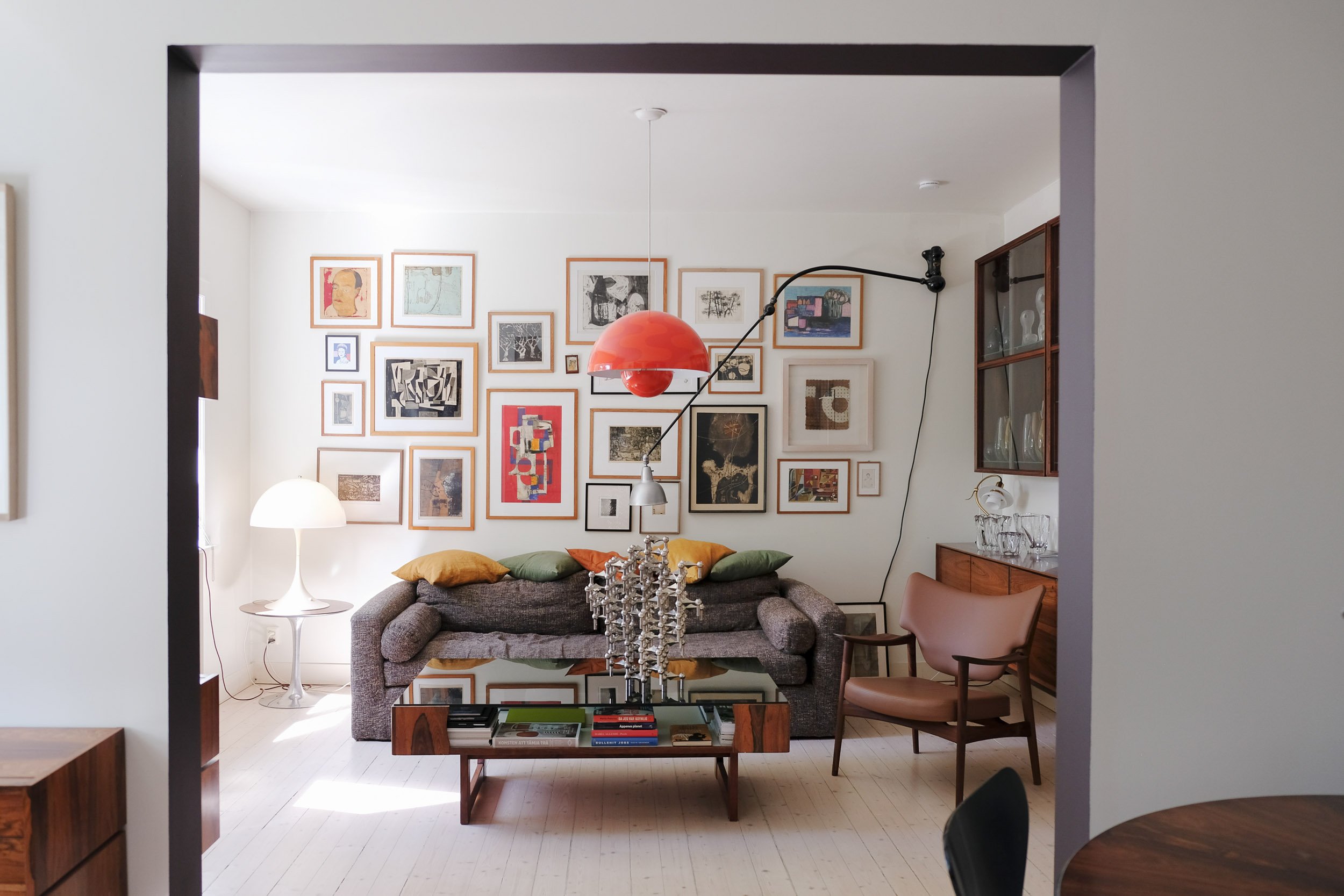
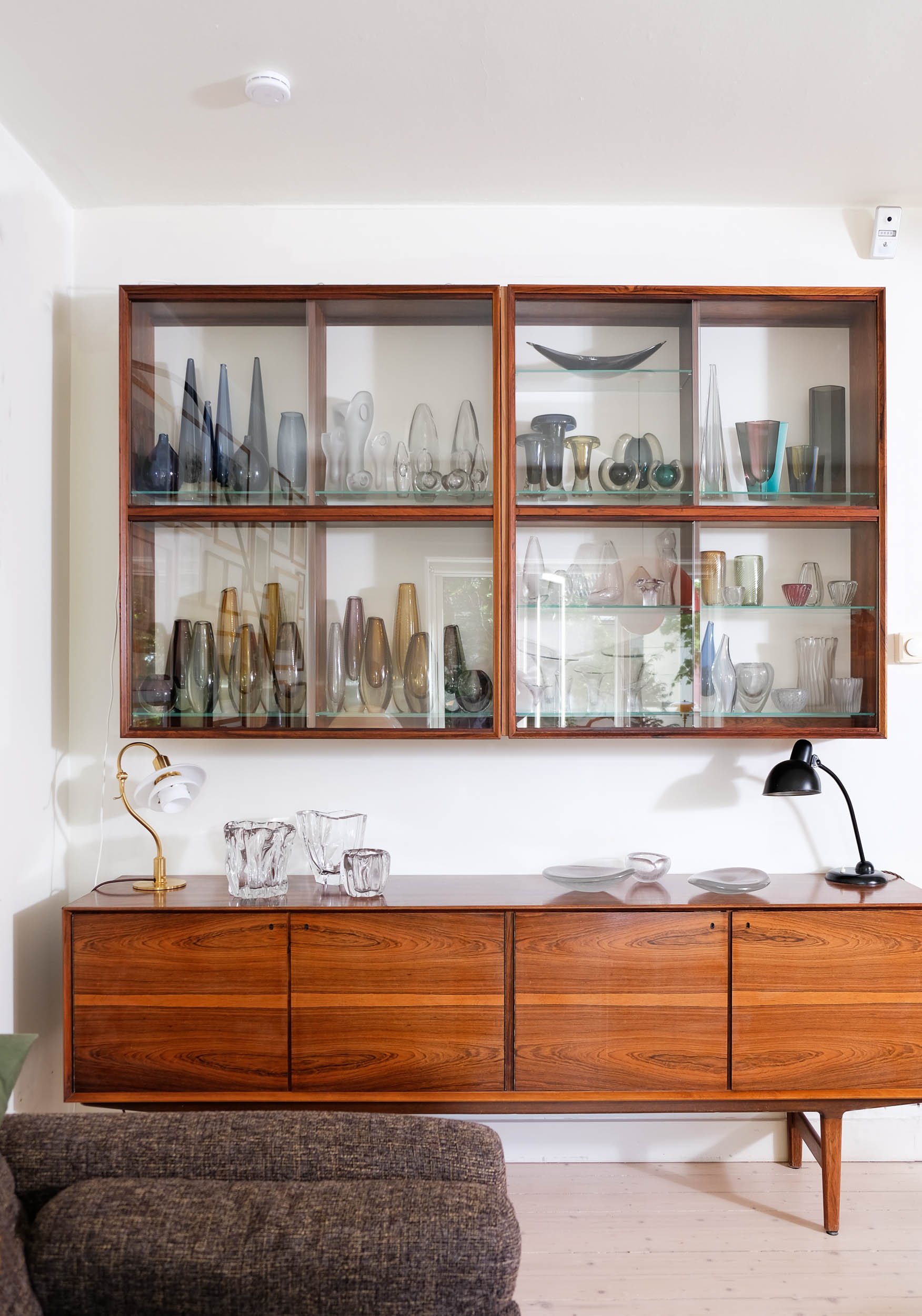
As for his domestic projects, Darrell hasn’t been particularly approachable, but as I have had the good fortune to have been to his and his wife Ulrika Hedendahl’s old country house in Sweden and his old apartment in Skovveien, which he made with Snøhetta architect Heidi Pettersvold, -I know that he has stayed true to his signature throughout everything he does. From collecting mid century design and decorative art, furniture and objects-to every project he finishes and the way he chooses to live, it is all about Form and Function. This coincidentally, is also the name of the concept he runs with Ulrika. Funnily enough she too has a background in the coffee shop business, or should I say era of around year 2000, having set up Kaffepikene and Karabista back in the day.
Today, the two of them have two kids together. Jesper who comes first :) of course, and then Form and Function, a project that turns up now and then as a pop up shop or as an exhibition set within a design historical context at venues like DOGA etc).
As it turns out when The Chromarty is visiting, they are about to revive F&F by accommodating to the SO ME conditions required today. So, very soon, you can buy THAT beautiful deep blue/green Sommerso and bubble glass vase from the 60’s while waiting for the tram on your way home from the bar as you scroll through your instagram feed after a glass of wine or three. Click on an impulse and it will be on its way soon enough with ‘helt hjem’.. For today, you have to make do with their website though. It takes time to build an online universe..
Collecting
Over the past 20 years, not only has Darrell designed rooms for these objects to inhabit, he has also filled a whole barn in Sweden and rented storage space for those extra rare pieces that he ‘one day’ will let Ulrika dispense with through formandfunction.no She is the one with the business degree, the wizard of admin and self taught knowledge about online presence.
So while we have to wait patiently for the opportunity to publish pictures from their kitchen in the secret hideaway in Sweden, the Chromarty can share some snaps from their city dwelling where they’ve lived for the past 20 years. As it happens, the family of 3 (plus the collection) is looking for THAT atrium house which Darrel can continue to mold with his own bare hands. As it happens, he was a trained cabinet-maker before going to university for his degree. Also, as he planned out the apartment very carefully, it hasn’t aged at all and could easily appear new, in all its modernity and style. The «wow» kitchen could probably outlast the building itself.
The king of DIY
‘I simply can not let anyone do what I am capable of doing myself.. with the added bonus of not having to pay for it. I enjoy creating and restoring because I can, and I like the process of learning new things’.
After our fourth cup of coffee during this interview Ulrika and I are all smiles.
This is a lifestyle I guess. For them, it is personal, everything they do seems to be.
‘It’s like this, Darrell had just got this place when we met, and I guess I got us most of the house in Sweden, so we have kind of been each others gold diggers.. and now , well we have shared projects as well as our family to run..
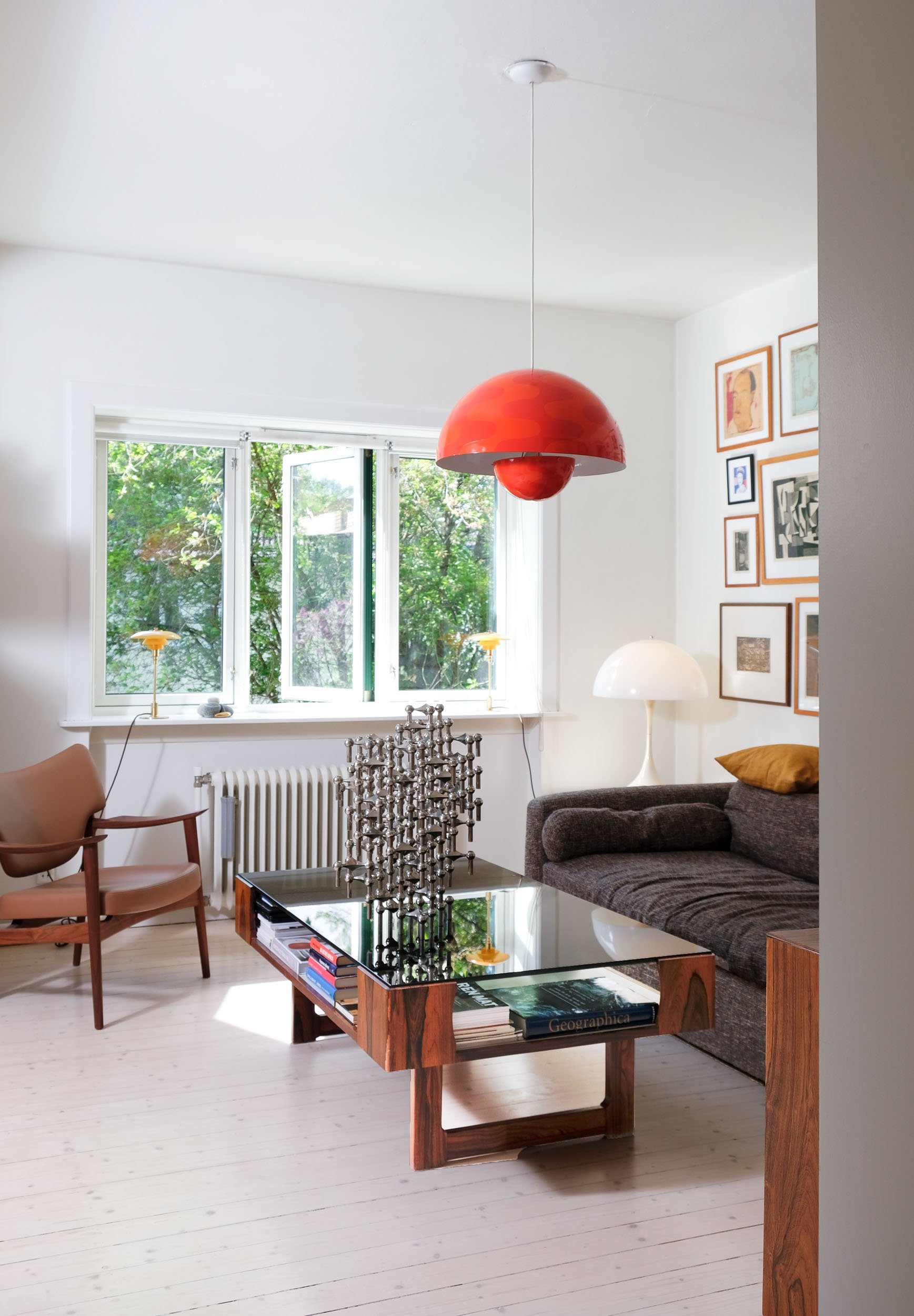
When Darrell decided on this particular apartment, it was because of the location. There is lots of greenery here. Valleløkka is a secluded and charming area that many Oslo people are not aware of. It could easily be compared to some of those historical posh private or preservation parts of London.
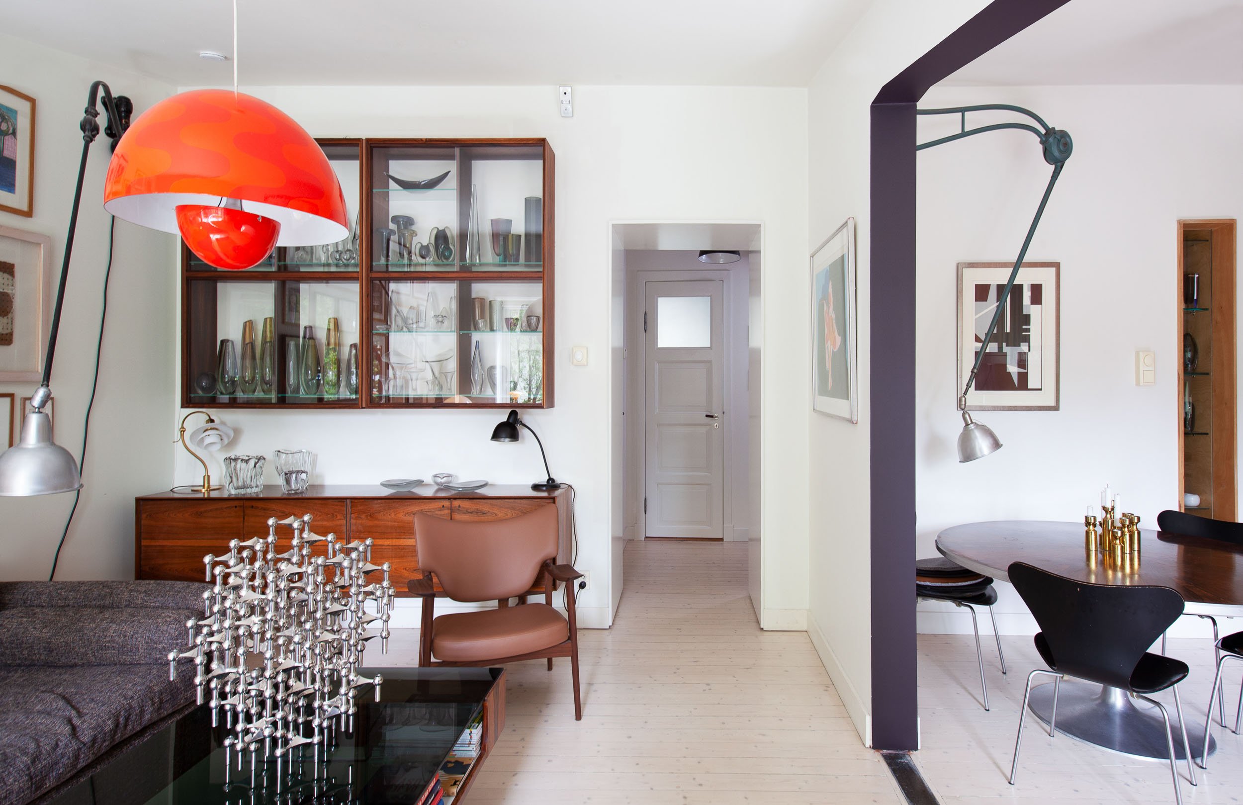
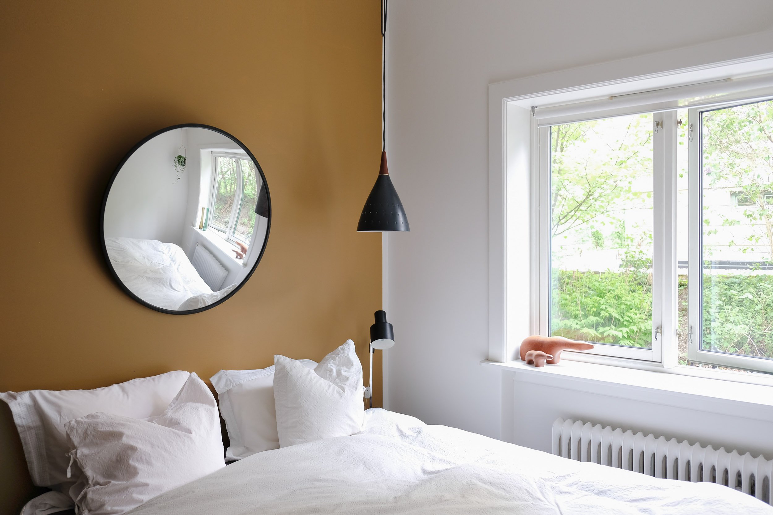
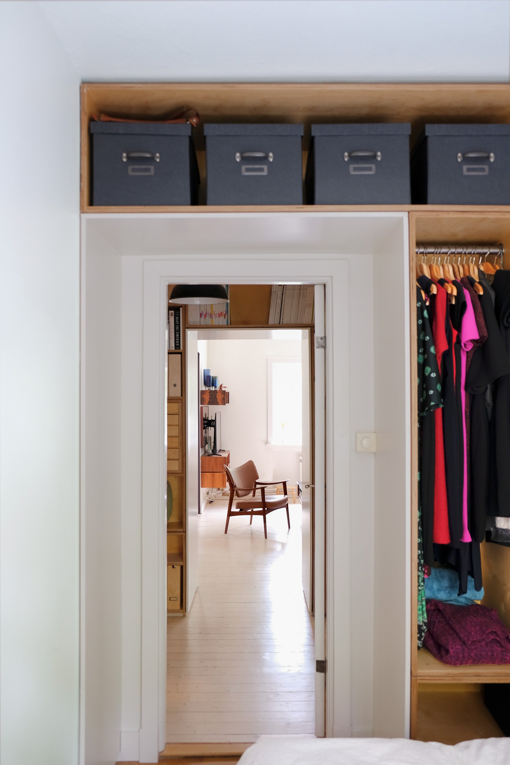
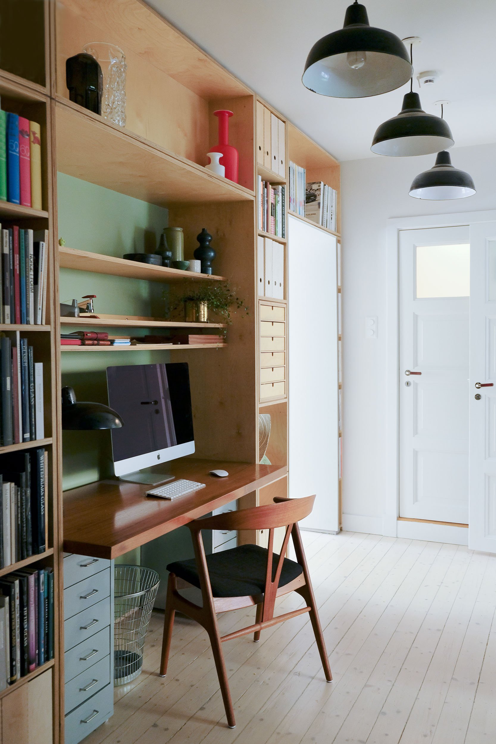
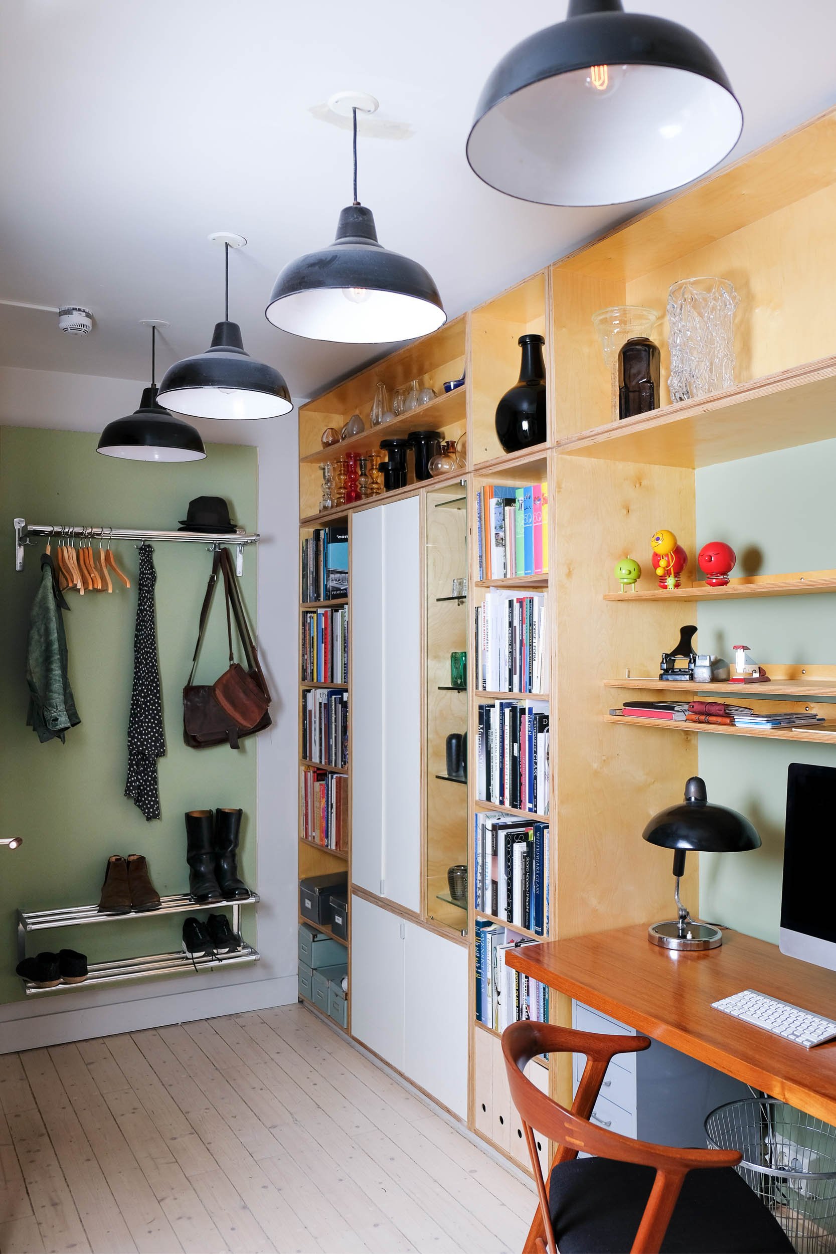
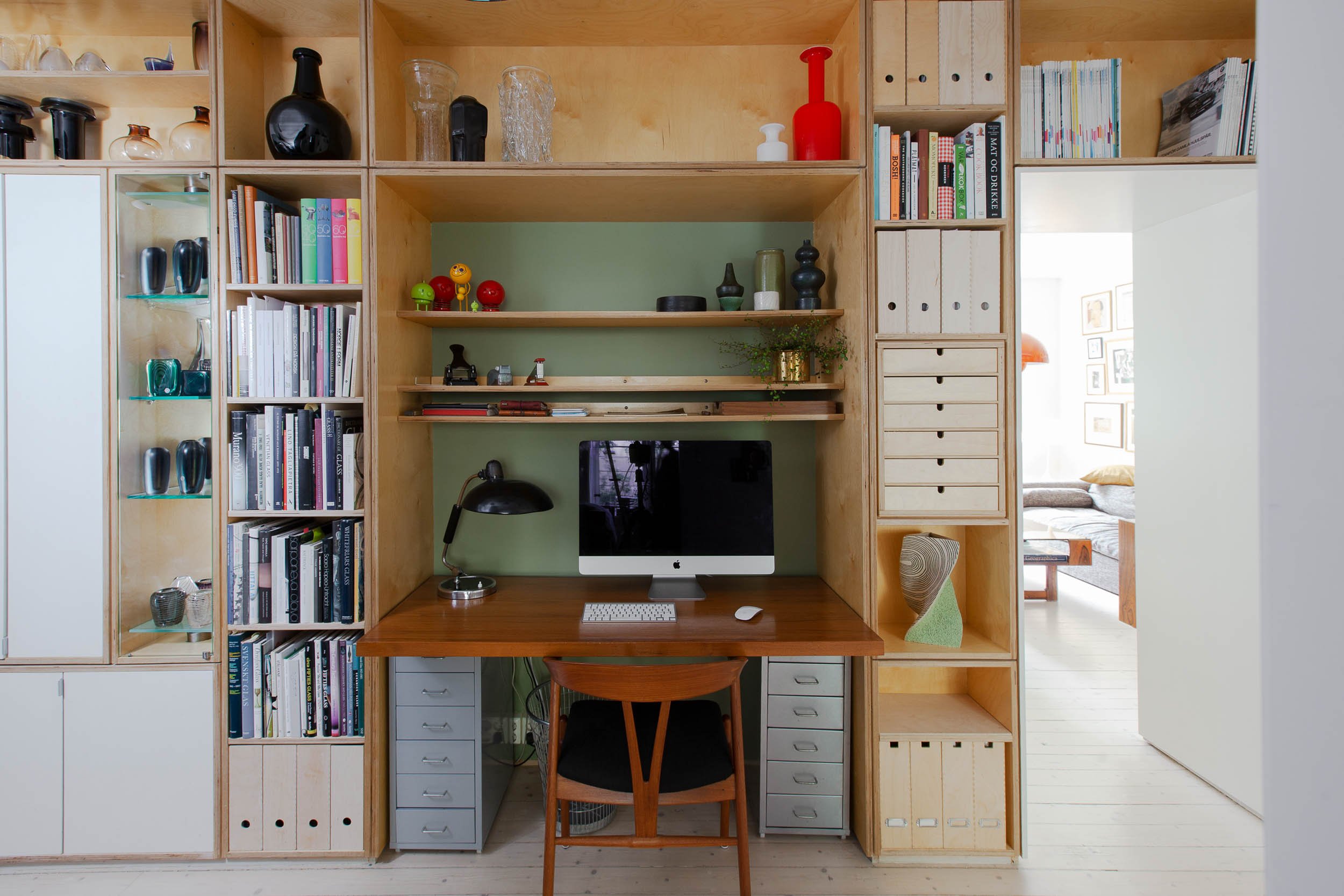
Only this apartment was an ordinary affordable one bedroom funkis apartment with great potential for an architect. ‘It could be molded, and there was a way of making this into a two bedroom apartment with a large dining kitchen and equally sized sitting room. Added to this I was able to fit in an office in the long corridor which basically was nothing but dead space.
Again, focusing on form as well as function, Darrell has even managed to create long sightlines throughout the apartment with generous openings between the rooms, or even little glass windows.
The Kitchen- A piece of furniture
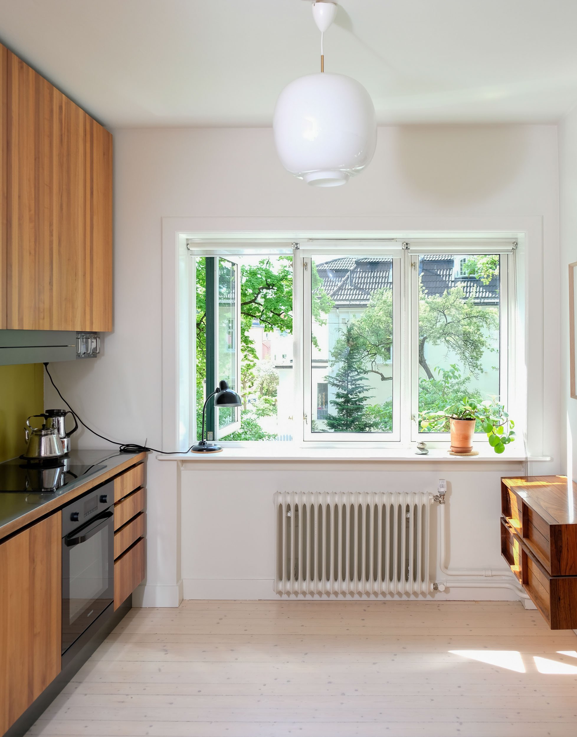
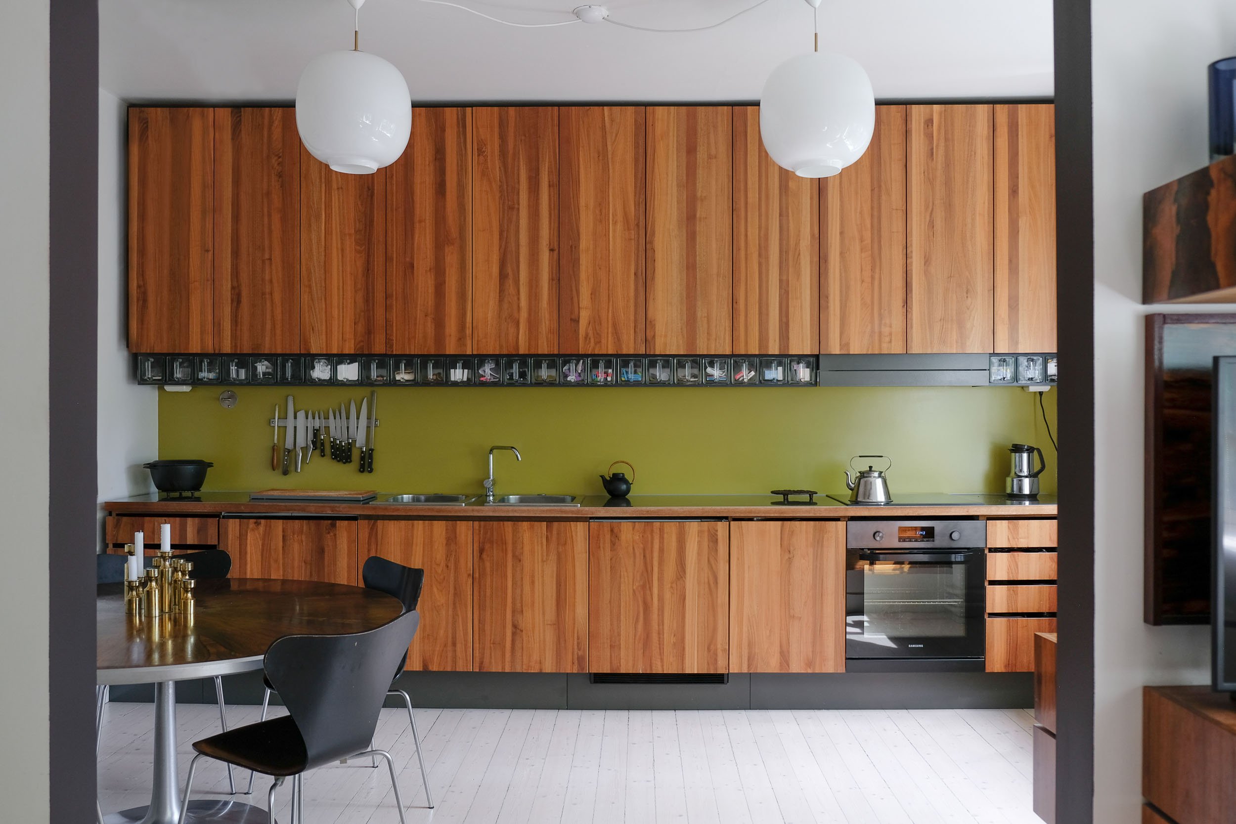
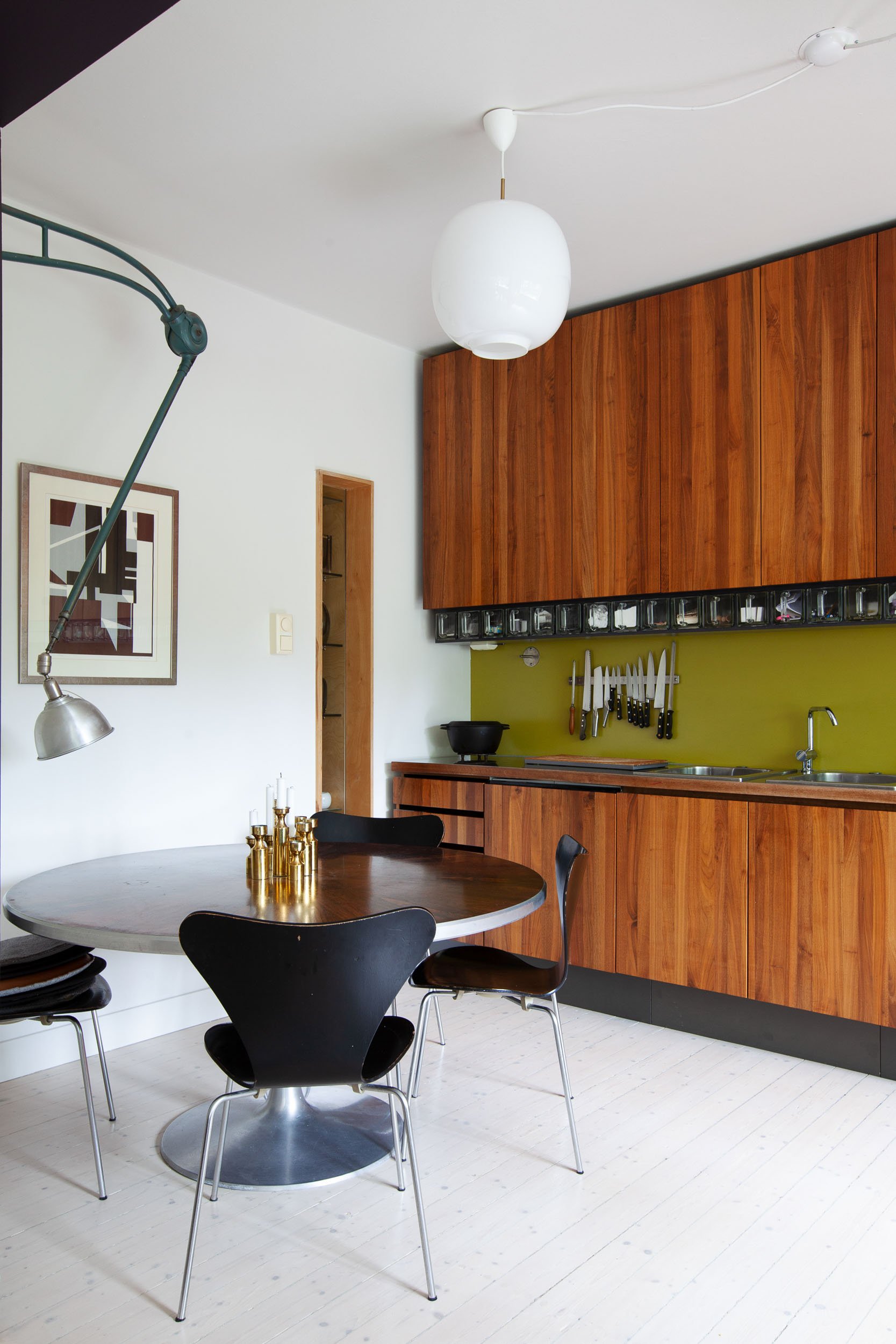
Still, I have to spend a few sentences on the wa-wa-woom kitchen made from walnut all the way through the frame and doors/drawers. As it was built by Frantz Menne at Fram Trapp og treinteriør just about 20 years ago, it could easily be presented as the latest trend, if it wasn’t for the wood having patinated slightly more than the newer ones in the magazines..
I didn’t want the kitchen to look like a normal kitchen, but more in the lines of a piece of furniture. A piece you would collect and protect by treating it well’.
I agree. Someone will buy this apartment mainly because of the kitchen. I know in France, it is not unusual to take the kitchen with when you sell your house.. Seemed like an odd thing to do, but not anymore..
You can actually sit and watch the kitchen from the sofa, i mean, as something meditative you know? Each door looking like it came from the same pice of wood as the next. All born from the same mother at the same time.
Lost and Found
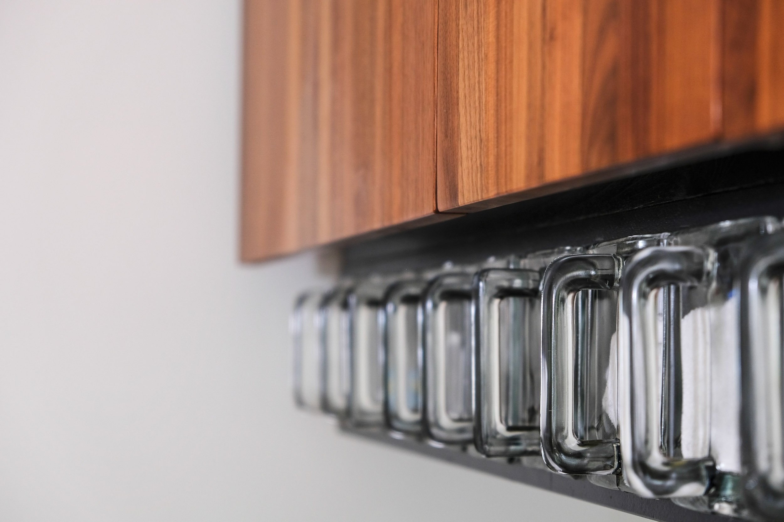
The glass drawers, they all function as what we would call ‘roteskuff' in Norway. Only here, the mess and chaos is kept separate..The glass helps you see where everything ended up. The containers have been collected over the years by Darrell who knew exactly what they would be used for at some point in the future. He did the same ‘hack’ in his previous apartment. (Which randomly came up for sale whilst this text was written..and not surprisingly, it looks basically the same as when it was sold all those years ago. Which says something about the timelessness of the design. Yes, the kitchen still stands there, like a majestic sculpture.
Darrell tells me that he couldn’t afford teak at the time, but opted for walnut as a second best, something he does not regret. ‘It is as if all the wood I have used in the apartment is now getting old enough to look almost the same, teak, rosewood, walnut…’
Worth noting of course, is that all the wood is ‘old’ reused, up-cycled or customized vintage furniture. Recycling has been something he has done intuitively since he got his first home.
Ulrika smiles again and says that everything they have apart from the kitchen is second, third or fourth hand..
I can still remember Darrell as a visible character at Vestkanttorget or in the very early morning at a flea-market early 2000 when I myself was a regular visitor. Right when they open the gates, he walks calmly through with focused eyes and his now grown up daughter on his shoulders. At that time he didn’t have a car and managed through all the weekend-markets on his bike, a telltale sign of a passion that hasn’t let up over the years, though now, some of his earlier finds are for sale as third hand or even fifth hand objects..
Turning point
Over the past few years, Ulrika, Darrell and Jesper have, like the rest of us, spent more time at home together rethinking, or rather developing their thoughts about what constitutes a home and being more self sufficient. They have come to the conclusion that now that their professional lives are merging with their private lives, they can see other mergers as well. The plan is to ‘rebuild’ their existing home which they love, in an atrium house, which basically is an apartment as it is still on one level, but but with their own private secluded garden as a centre. This will meet all their needs as Jesper depends on a wheel chair, Darrell could do with a workshop in the basement and Ulrika wants to grow things in the garden and have easy access as well as a private private space outside.. Good thing then, that there are several estates in Oslo and surrounding areas with this kind of architecture. Only this one is not borrowed from the UK.
The atrium-style house came to Norway via Denmark, where architect Jørn Utzon first showed them at an exhibition in 1954. The clear demarcation between private and public gardens and its uniquely private exterior space within the perimeter of the house itself were seen as its top selling points. Besides this, the houses were efficient in terms of space while mirroring the then dominant family ideal of of the nuclear family as an enclosed unit.
Which suits them perfectly.
-And with the ongoing dialogue around Ammerud grenda for instance, (which is one of those estates) and a number of owners’ need for expanding their properties, they thereby change the facades as they themselves see fit. Which is why Byantikvaren began plans for regulating this neighbourhood. This is a unique area, representing Oslo’s finest architecture from the 60’s. ‘Any added elements need to be integrated in such a way that they do not interfere with the overall style, but rather enter into a dialogue… This will create coherence and be unifying for the area as a whole’.
Which is perfectly in line with Darrell’s general thinking..
‘I will treat it as if I inherited it’ and I generally always think about any project like this: How would the architect have done it back then if he or she could do what we are able to do today?

